8+ Years of Logo Design: Selected Work From 2018–2026
Putting this selection together required a little digging. I have spent years working full-time in design and marketing with existing brands, where not every workday starts with a new logo brief.
When I do get new brand design requests, I’ve increasingly enjoyed art-directing logo projects and developing ideas together with other designers and students. So I first had to remember which ones I had actually designed myself.
Here is a selection from 2018–2026, created for different clients, organisations and projects along the way.
Early Marks
My first "real" logos meant designing identities for projects close to myself and my own business. It’s still one of the first things you need when you start something new. Otherwise, what are you going to print on mugs and T-shirts?
In early 2018, I registered my own business with two of my school mates.
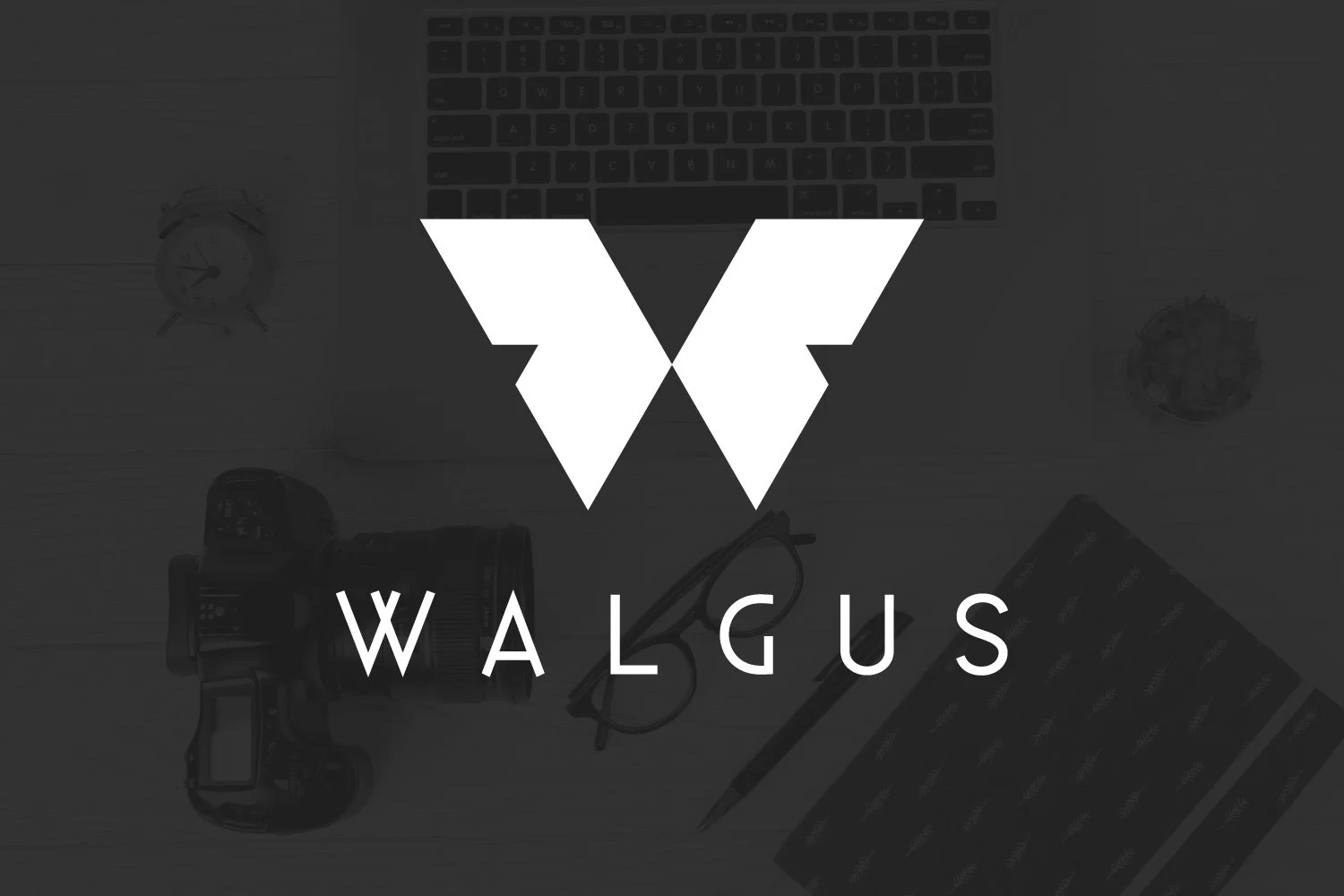
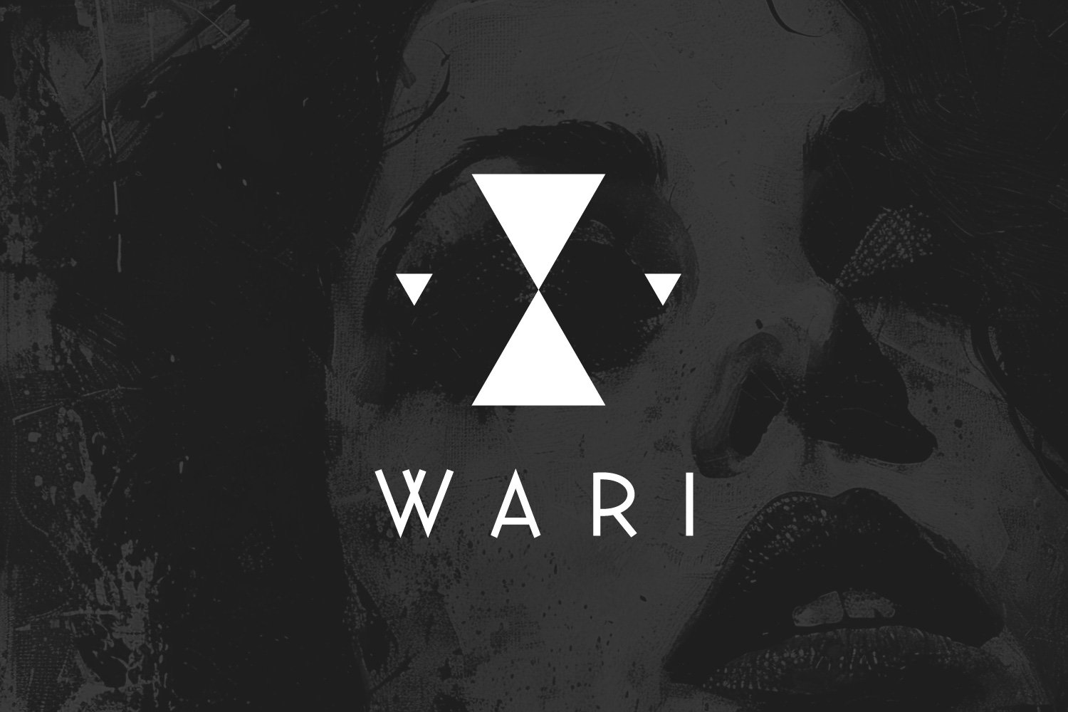
Walgus and Wari logos were designed in 2019 and 2020 as counterparts: the shapes of Wari fill the negative spaces within the Walgus logo. The idea extended to the businesses themselves – the same creative network, with Walgus focused on corporate work and Wari on personal, experimental and smaller creative projects.
Sõnad ja Hääled (translation, voiceover and proofreading services), one of my first “real” clients under the official Walgus brand, 2018.
Ake photographs concerts, we were classmates at Tallinn Polytechnic School.
In the early days of Walgus, the portfolio was a bit of a chicken-and-egg problem: clients wanted to see previous work before giving us new work. Our co-founder Reio brought his portfolio, and designers who joined us later brought theirs. Eventually the problem reversed – there were enough real Walgus projects that the question became what to leave out.
Making Letters Fit
Then you start getting noticed by clients outside your immediate circle – people who aren’t your extended family, friends, or friends of friends.
ET Collect (a waste management startup) and L&K Finance (an accounting service) were both designed in 2019, when I was living in Romania.
Both of these logos came from experimenting with how capital letters could overlap, connect and share shapes. Both clients had also found us through the Walgus website, which was a nice sign that our marketing and SEO were actually working.
Logos with a Character
Sometimes logo design also means character design – and occasionally, cute animals.
Both of these two here started with explicit client requests: a sabre-toothed squirrel for Fanlan, mobile tyre service (2020), and a parrot for Targimli, a translation service (2021).
Fanlan is especially nostalgic for me. I remember reading the client’s email about the project in Bucharest on my way to visit the hospital, shortly before my son was born. I suppose I felt a little like that happy squirrel myself.
Round Logos
I’ve always liked logos with big round elements. They have a vintage feel and also fit nicely into social media profile circles.
These are two examples from 2021: Otto Knives and Tallinn University of Technology Academic Women’s Choir 70th anniversary logo. It was still COVID times, so both were designed from my home office in Saue.
Logos for E-commerce
Sometimes the format is shaped by where the logo needs to live.
Fashion Look (2021), Areaal.ee (2022) and VR24.ee (2024) were all designed for e-commerce stores, so a compact horizontal layout with a logomark for a favicon and text that worked well in a website header was an important consideration from the start.
Brands Within Brands
From 2022 to 2024, I helped develop visual identities for several brands and projects connected to ROI, Estonia’s largest promotional products agency. ROI's original logo, with its crown and serif text, had been in use since the 1990s, so some of the new identities had to stay recognisably connected to it.
My design work included a sustainability-focused range ("Loodusega tasakaalus"), locally produced foods personalised for corporate clients (Hõrk), the sustainable textile printing company Go Green and a workwear range (ROI Workwear). Each had its own purpose, audience and relationship with the main ROI brand.
A Few Personal Connections
Even after I had started hiring designers in Walgus and letting them take on more of the work, there were still some projects I couldn't bear to give away. I simply had to design them myself.
Vimm metal band logo, spring 2023.
Vimm is one of the few logos I’ve designed that I also wear on T-shirts regularly. It belongs to a black metal band where my high school deskmate Aleksei plays guitar.
Tallinn Polytechnic School 110 logo, autumn 2025.
Designing the 110th anniversary logo for Tallinn Polytechnic School had a personal significance: I had started my creative business while studying there, then graduated from the same school and later returned as a teacher. The anniversary also marked its final school year under the Tallinn Polytechnic name, before becoming part of Tallinn Technology College (Techno TLN).
The symbol is based on the distinctive tower at the corner of the school building. A colleague later pointed out that she also saw a mourning candle in it – which had never occurred to me, but became difficult not to see once mentioned. Farewell, Polütehnikum!
Designing Within a Marketing System
Working at Tallinn Folk High School has given me plenty of opportunities to design logos from 2024 to 2026: for the school’s 65th anniversary (Tallinna Rahvaülikool 65), a new video series (Koolitaja kolmapäev), the school’s slogan (Parim aeg õppida) and most recently a new integration programme (Tallinn Connect).
Despite their different purposes, all Tallinn Folk School project logos follow the same 8-degree upward angle and similar sans-serif fonts from the school's visual identity.
And there you have it – some logos and the stories behind them. More logos will probably find their way here eventually.